📖Practical Typography
- authors
- Butterick, Matthew
- year
- 2010
- url
- https://practicaltypography.com/
typography in 10 minutes:
start with body text
point size. 10-12pt for print; 15-25px for web.
line spacing. 120-145% (line-height: 1.3)
line length 45-90 chars or 2-3 lowercase alphabets.
fonts
extra
never underline (except perhaps for web links)
use 5-12% extra letterspacing with all caps and small caps
§ Typography is inevitable when you put text in writing.
Is typography an art? That’s like asking if photography is an art. Certainly there are photographers and typographers whose ideas and techniques raise their work to the level of art. But at their core, both photography and typography perform a utilitarian function. The aesthetic component is separate. Being an effective typographer is more about good skills than good taste.
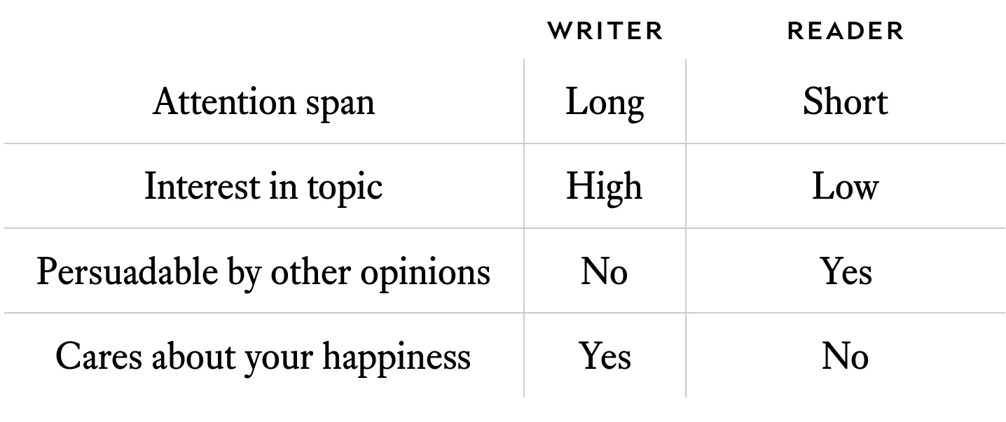
Reader’s attention is a valuable resource.
Typography is like non-verbal communication. It is not the most important thing, but it certainly counts.
parentheses, brackets, and braces should not adopt formatting of the surrounded material.
sometimes it’s ok to do so if the font will make roman/italic collide
thin space (
 ) can be used when standard space is too large (e.g., after periods: W. A. Dwiggins)do not underline
Use bold or italic, not both.
Do not use italic with sans serif fonts. Good serif fonts are usually hand-drawn to have a different shape in italic, sans serif fonts are usually just slanted and that’s usually not enough for them to stand out.
Headings
Do not use too many levels. 2-3 is a good maximum.
Add spacing before and after. That’s both subtle and effective.
Use bold, not italic (bold is easier to read and stands out better)
Do not underline
Do not center
Don’t use all caps. If your headings are full sentences, they are too long for all caps.
It’s ok to make point size bigger, but just a little.
Suppress hyphenation so headers do not break awkwardly
If you use bold in your headings, try reducing the point size a little (0.5–1 points).
Letterspacing is adjusting space between all characters. Unlike kerning, which affects specific pairs of letters.
add letterspacing for all caps